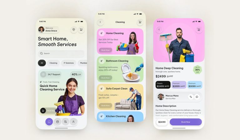
Mobile UI Design Tips for Better User Experience 2025
After building 300+ successful apps, we’ve learned something crucial: users don’t care about your clever animations or cutting-edge design philosophy. They care about getting stuff done. Here’s how to create mobile interfaces that actually work in the real world.
Why Most Mobile UI Design Fails
Let’s be honest: most apps overcomplicate things. Designers get caught up in:- Showing off their creative skills
- Following trendy design patterns
- Adding unnecessary features
- Creating “innovative” navigation systems
The Foundation: What Users Actually Want
Based on thousands of user sessions, here’s what matters:- Instant recognition of what to do next
- Quick access to primary functions
- Clear feedback on their actions
- Consistent behavior throughout the app
- Fast loading and smooth performance
Core Principles That Actually Work
1. Clarity Over Cleverness
- Use standard UI patterns users already know
- Make interactive elements obviously interactive
- Keep navigation consistent and predictable
- Use clear, concise labels
2. Hierarchy That Makes Sense
- Primary actions should be unmistakable
- Secondary actions should be accessible but not dominant
- Group related items logically
- Use visual weight to guide attention
3. Feedback That Communicates
- Show system status clearly
- Make error messages helpful and actionable
- Confirm important actions
- Indicate progress during delays
4. Touch Targets That Work
- Make buttons big enough (minimum 44×44 pixels)
- Space interactive elements appropriately
- Account for thumb zones
- Consider one-handed use
5. Content That’s Actually Readable
- Use sufficient contrast (WCAG 2.1 standards)
- Pick appropriate font sizes (minimum 16px)
- Maintain comfortable line lengths
- Structure content for scanning
The Technical Side: Performance Matters
Good UI isn’t just about looks. It needs to:- Load quickly (under 2 seconds)
- Respond immediately to input
- Handle poor connections gracefully
- Work across different devices
Common UI Disasters (And How to Avoid Them)
1. The “Where Am I?” Problem
- Clear navigation hierarchy
- Visual breadcrumbs
- Consistent back button behavior
- Location indicators
2. The “What Just Happened?” Issue
- Clear action confirmation
- Obvious state changes
- Error recovery options
- Progress indicators
3. The “How Do I…?” Frustration
- Intuitive primary actions
- Clear call-to-action buttons
- Logical feature grouping
- Progressive disclosure of complex features
Testing That Actually Matters
Forget perfect-world scenarios. Test for:- Different screen sizes
- Various network conditions
- One-handed use
- Distracted users
- Edge cases
- Accessibility needs
Real-World Implementation
1. Start With User Flows
- Map primary user journeys
- Identify key interaction points
- Plan error states
- Document edge cases
2. Create Your Design System
- Define color palette and typography
- Establish component library
- Document interaction patterns
- Set accessibility standards
3. Build Your Prototype
- Start with core flows
- Test with real users
- Iterate based on feedback
- Document what works
4. Implement and Test
- Maintain design consistency
- Check performance
- Validate usability
- Monitor analytics
Tools We Actually Use
- Figma for design and prototyping
- Principle for advanced interactions
- UserTesting for remote validation
- Analytics for behavior tracking
Measuring Success
Track these metrics:- Time to complete primary tasks
- Error rates
- User retention
- Session duration
- Support ticket themes
- App store ratings
When to Break the Rules
Sometimes you need to innovate, but only when:- Standard patterns don’t solve the problem
- You have data supporting the change
- Users actually benefit
- You can validate the new approach
The Reality Check
Before launching, verify:- Can users complete core tasks without help?
- Does the UI work on all target devices?
- Is performance acceptable?
- Are accessibility standards met?
- Can you maintain this design long-term?
Next Steps
- Audit your current UI against these principles
- Identify your biggest usability issues
- Create a prioritized improvement plan
- Test with real users
- Iterate based on feedback
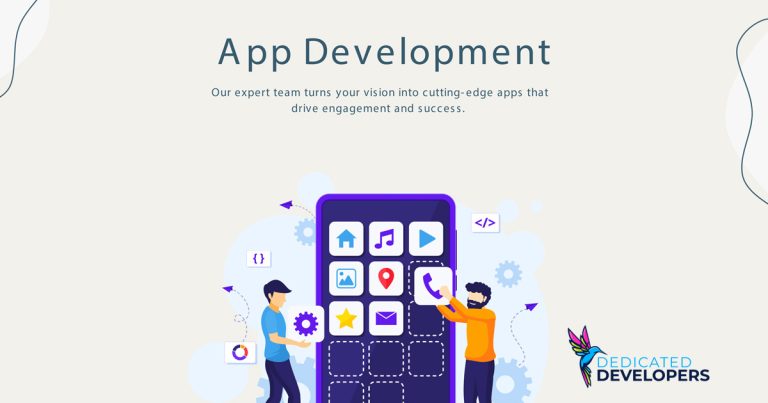
Need help turning these principles into reality?
Our Blueprint process includes detailed UI planning and validation. Let’s talk about your app.