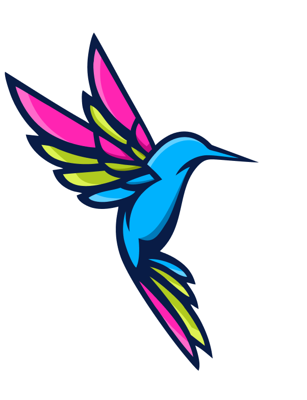
Our Brand’s
Visual Evolution
After 18 years and 300+ successful apps…
…we realized our look and feel just didn’t say enough about who we are and what we’re about as a company. Our logo felt dated and utterly forgettable. Our website screamed “we write code” (and nothing else). But we don’t just write code. We build app businesses that thrive. And that meant a brand ID that’s distinctive and unforgettable.

The No-BS History of
Dedicated Developers
Our
Story


2007:
We Took Flight
2007–2008:
Affiliate Marketing Mavericks
Google Ads,
Done Right
2011:
Our First Web
Projects
2012:
2014:
The Blueprint
Is Born
2021:
Mastering
the App Stores
Time for a New Look
2024:
Ok, But Why The Hummingbird?
The moment we landed on the hummingbird, we knew it was right. Not because it’s pretty (though it is), but because the hummingbird is the ultimate symbol of:

Precision
Hummingbirds can hover with accuracy to within 0.08 of an inch. That’s not luck—that’s engineering perfection. Our code is just as precise. Because “close enough” is how you end up with 2-star reviews and security breaches.
Agility
Speed & Efficiency
Elegance
Ever watched a hummingbird in flight? That’s not just functionality—it’s art in motion.
Our code works the same way: clean, readable, maintainable, and beautiful under the
hood. Because elegant code doesn’t just perform better—it scales better, adapts better,
and costs less to maintain over time.
Vishal Bhatia, CEO

The Colors
There’s a Method to Our Madness
We didn’t choose our colors by committee or the CEO’s mood that day. Each one serves a purpose:

Electric
Blue
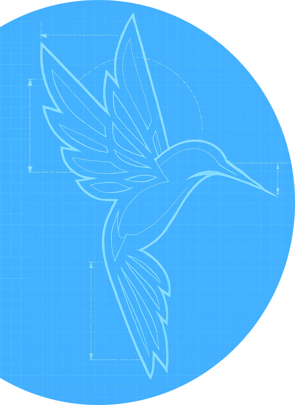
It's impossible to ignore—just like the results we deliver. (It also happens to be an accent color of the Blue-throated Hummingbird, one of nature's highest-performers.)

Deep
Navy
Because sometimes you need to get serious about results. This grounds everything we do after nearly two decades of experience.

Screaming
Pink
This is about our refusal to blend in with the sea of boring development firms. Also, it pops like crazy against the blue, which is exactly what your app needs to do in a crowded marketplace.
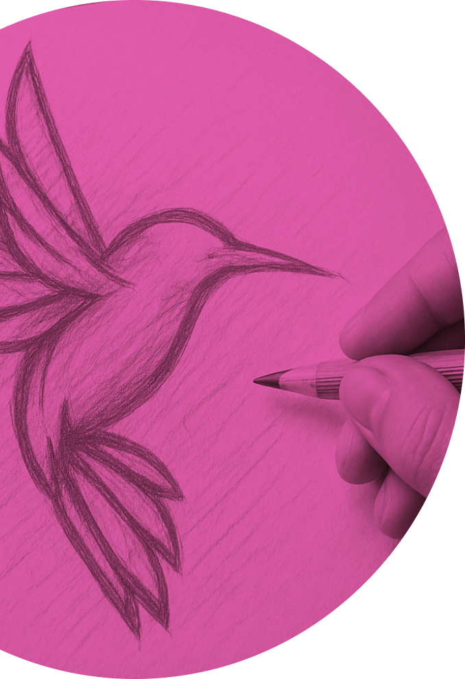
That
Green
It's the color of growth—and ultimately, that's what we care about. Your downloads. Your revenue. Your business success.
Nothing in our brand is accidental. We’re as intentional about our identity as we are about your app.
“Creating our hummingbird was about capturing motion and precision in a single moment. We wanted something that felt alive and dynamic, just like our approach to development.”
Tobin Jay, CMO

From Idea to Hummingbird:
No Overnight Success Story
Our rebrand wasn’t some weekend project. The process was exactly like our app development approach: meticulously planned, obsessively executed, and ruthlessly focused on results. We went through dozens of concepts before landing on the hummingbird.
Why?
Because like your app, our brand needed to work as hard as it looks good.
Why Founders
Choose Us
“Our Idea-to-App Blueprint process maps the precise journey your app needs to take, avoiding costly detours and ensuring the most direct path to success.”
Vikas Bhatia, COO

The Blueprint Connection:

There’s a reason our Blueprint process became our signature offering. It’s the same reason the hummingbird is our perfect symbol:
Hummingbirds don’t just randomly flit around hoping to find nectar.
They develop precise flight paths, remember exactly which flowers yield results, and optimize their routes for maximum efficiency.
Sound familiar? It should—it’s exactly how our Blueprint works. We map the exact path your app needs to take from concept to market domination, eliminating the guesswork that kills most apps before they launch.
80% of apps fail in their first year. The 20% that succeed? They had a flight plan. They had a Blueprint.
Less Talk, More Action
Here’s what matters: Our new hummingbird identity reflects exactly what we deliver to clients—precision, speed, agility, and results that stand out.
*Before Our Slots For This Quarter Fill Up
We can’t make your app fly if you never leave the nest.
Get in
touch
now
